Jersey Roots
Brand Identity | Self-initiated Project
Jersey Roots
Brand Identity | Spec Work
Jersey Roots
Brand Identity | Spec Work
Jersey Roots
Brand Identity | Spec Work
Jersey Roots
Brand identity and packaging for a new South Jersey-based craft brewery that is taking beer back to the basics.
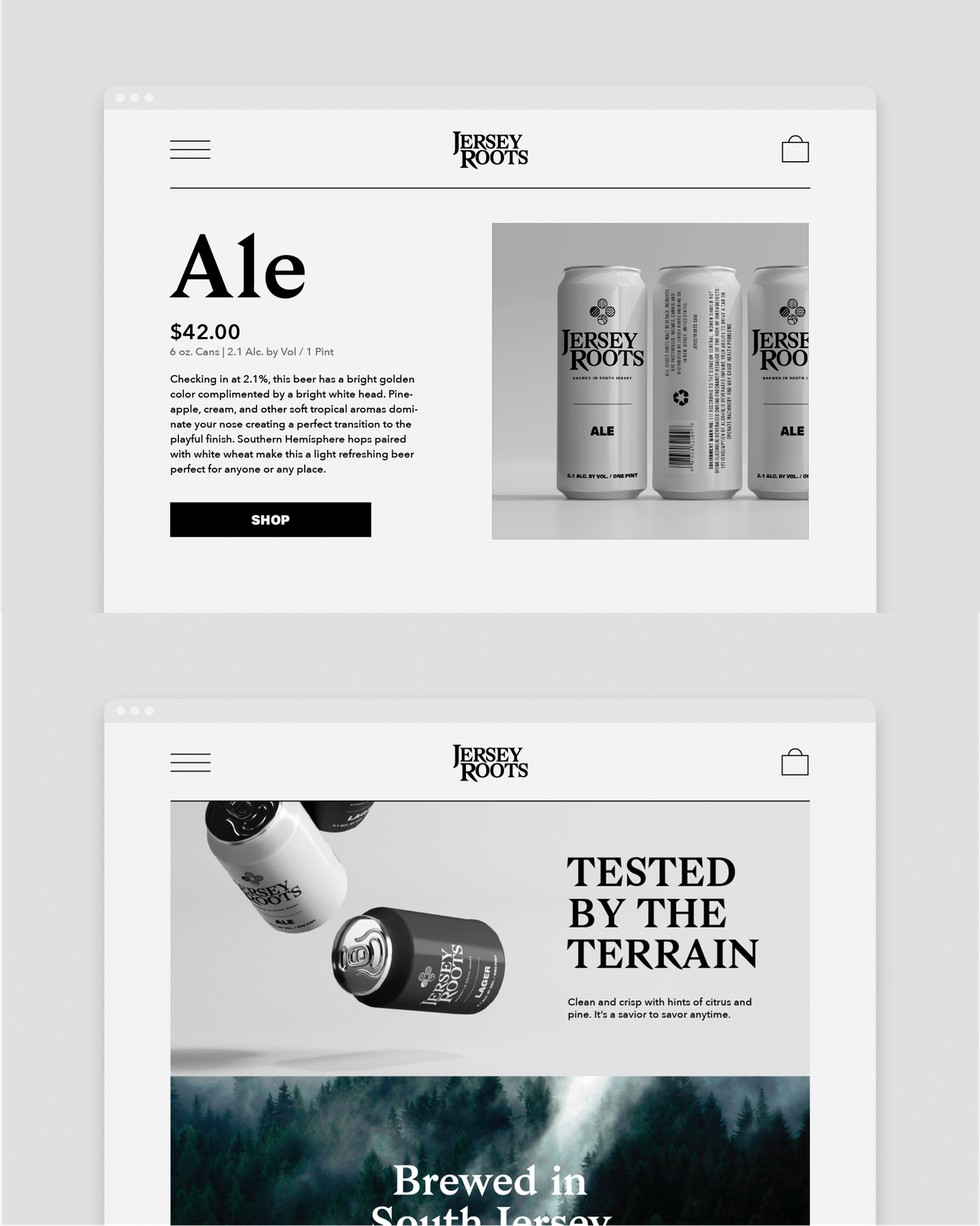
Jersey Roots was a beer brand that I developed with the intention of creating a high-quality craft beer brand that is easy to enjoy and accessible locally in South Jersey. The challenge is to create an identity that would help the brand stand out in what has become a very crowded marketplace.
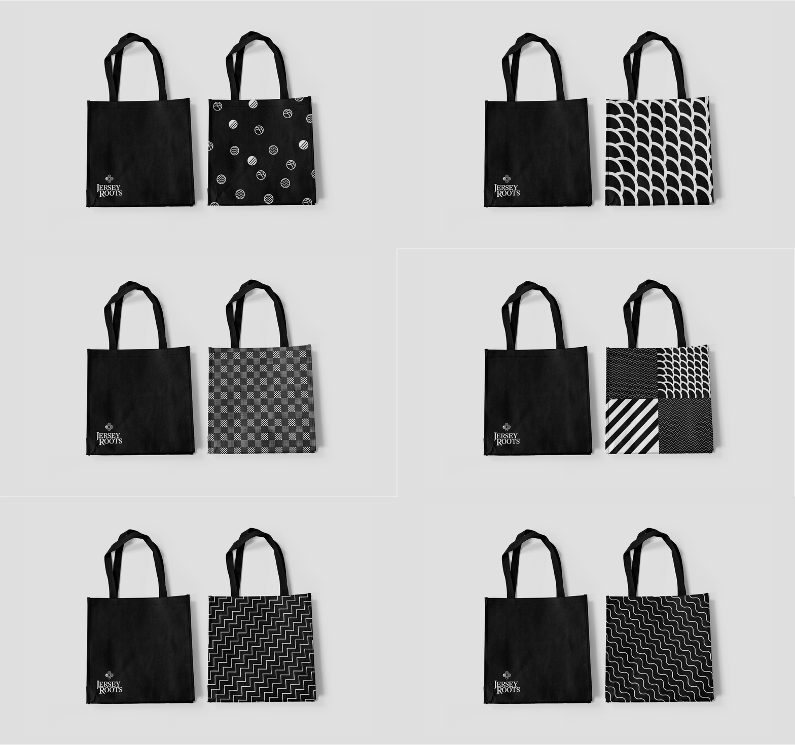
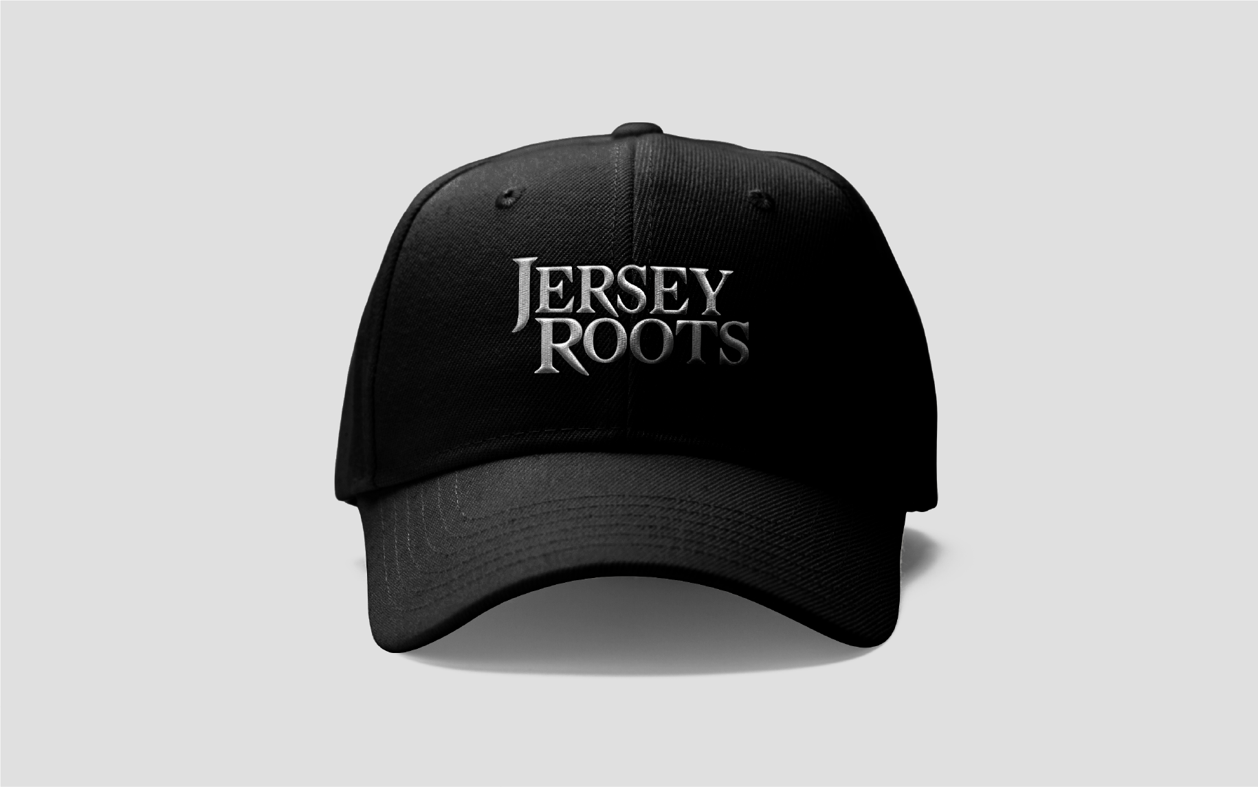
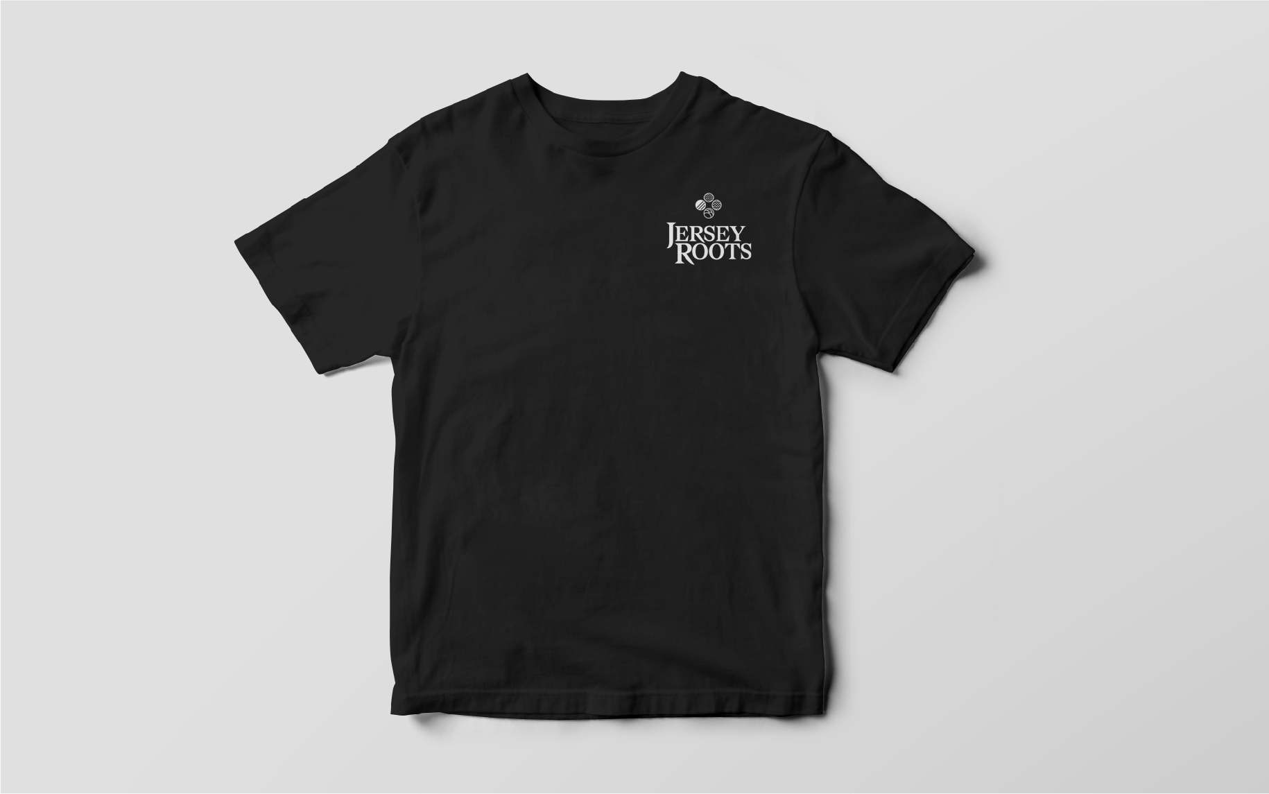
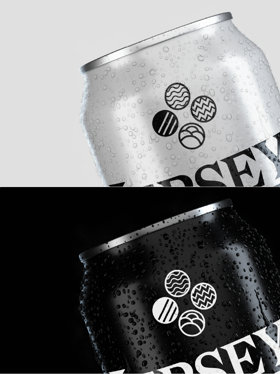
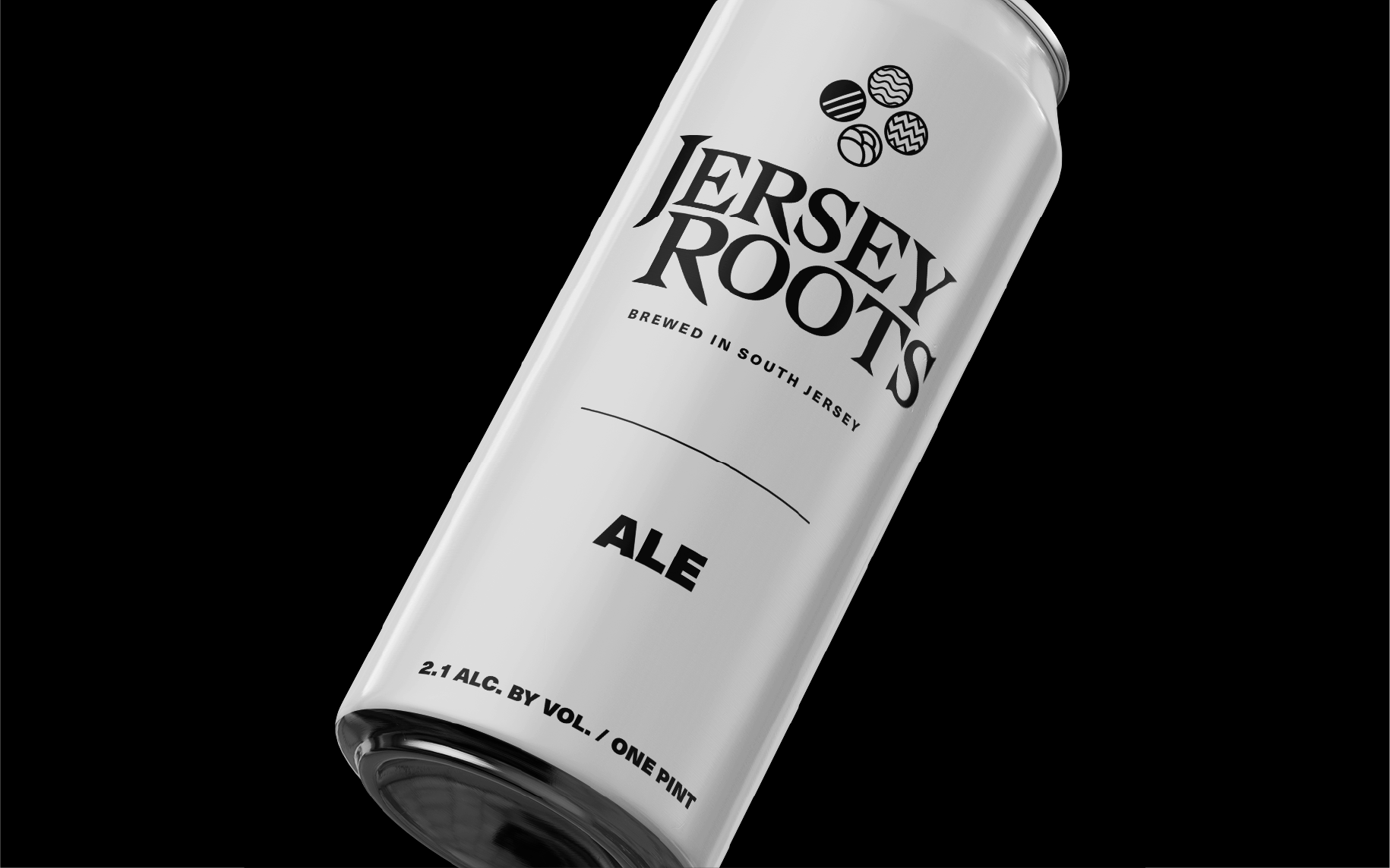
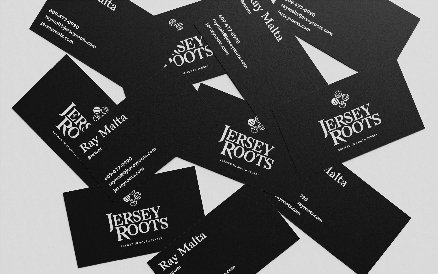
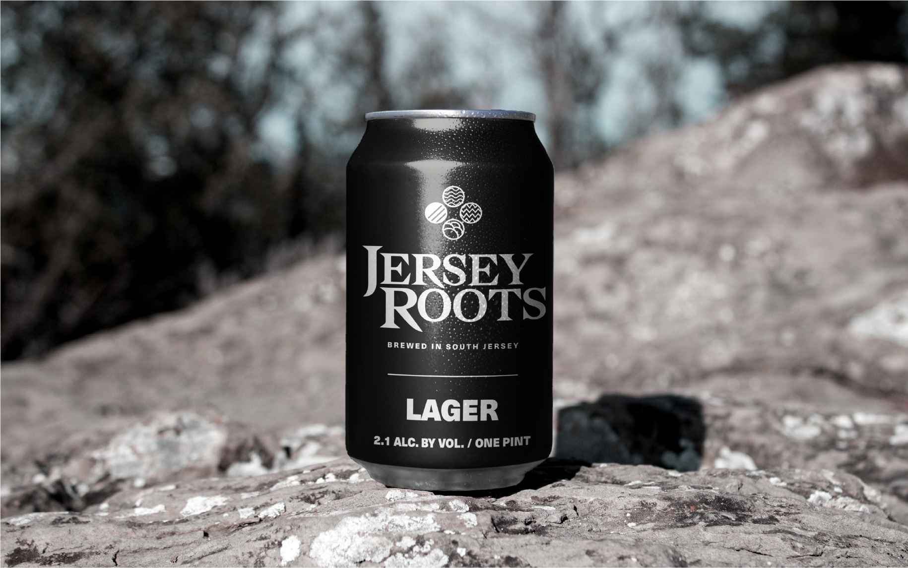
Creating the identity around South Jersey's misty and shadowy geographical appeal, the design has a traditional and discreet effect. The bold sharp logotype provides a great contrast to the round, almost cryptic emblem incorporated with the logotype. The kinetic line patterns in the emblem are reminiscent of naturalistic symbols and are repeated, manipulated, and printed around brand merchandise.
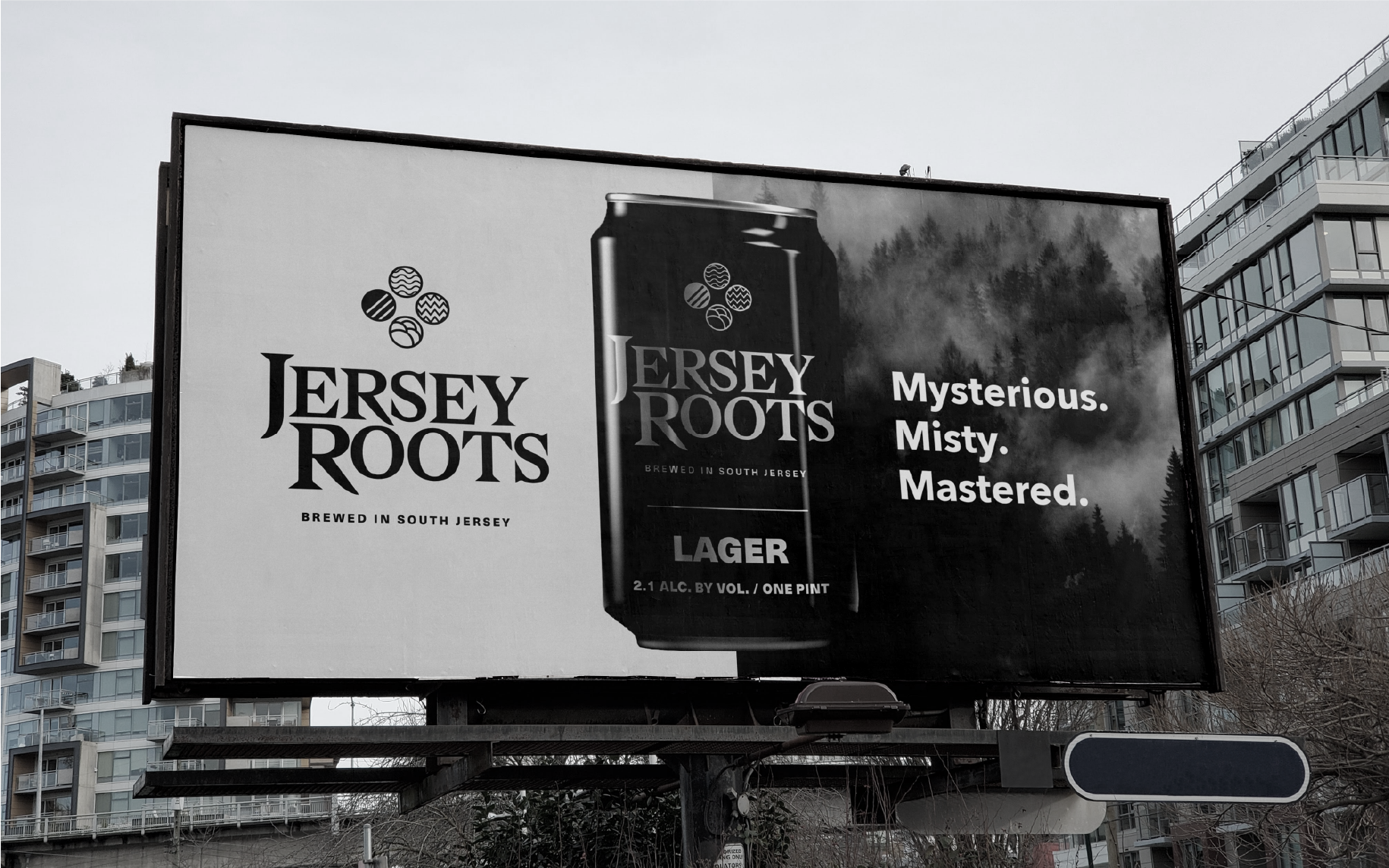
The branding reflects the brewery’s simplistic approach and mystical South Jersey feel.
I decided to use its nature insignia as its main visual language to further represent and explore the naturalistic and mysterious personality of South Jersey.
I decided to use its nature insignia as its main visual language to further represent and explore the naturalistic and mysterious personality of South Jersey.
I decided to use its nature insignia as its main visual language to further represent and explore the naturalistic and mysterious personality of South Jersey.
I decided to use its nature insignia as its main visual language to further represent and explore the naturalistic and mysterious personality of South Jersey.
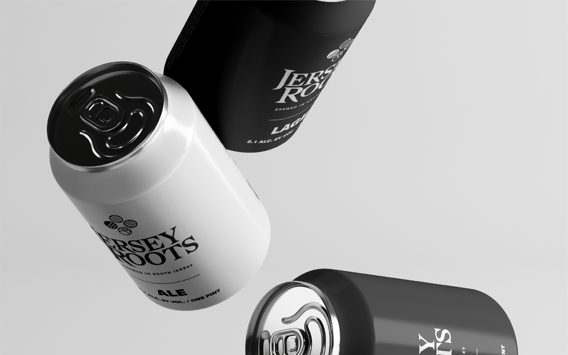
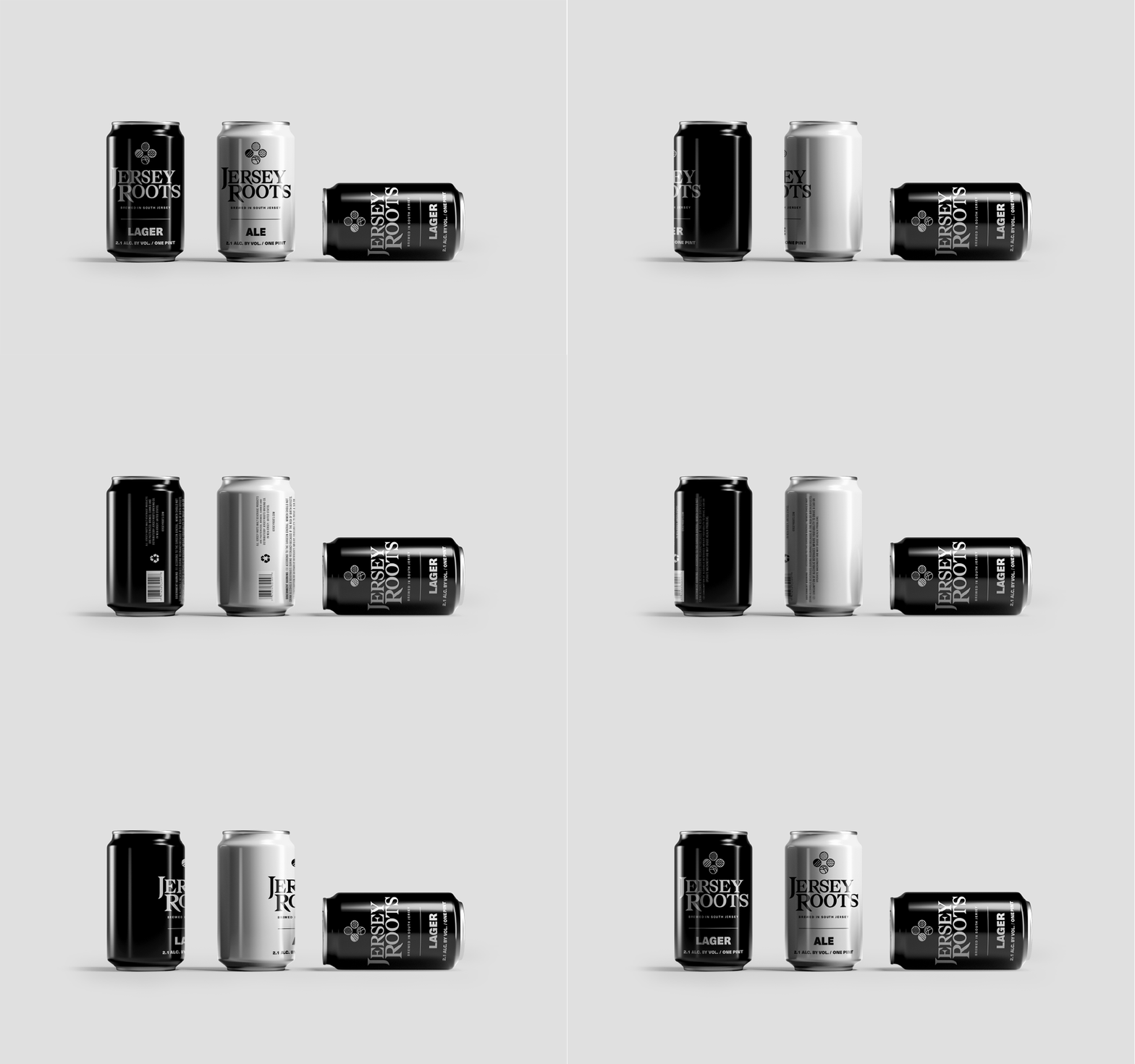
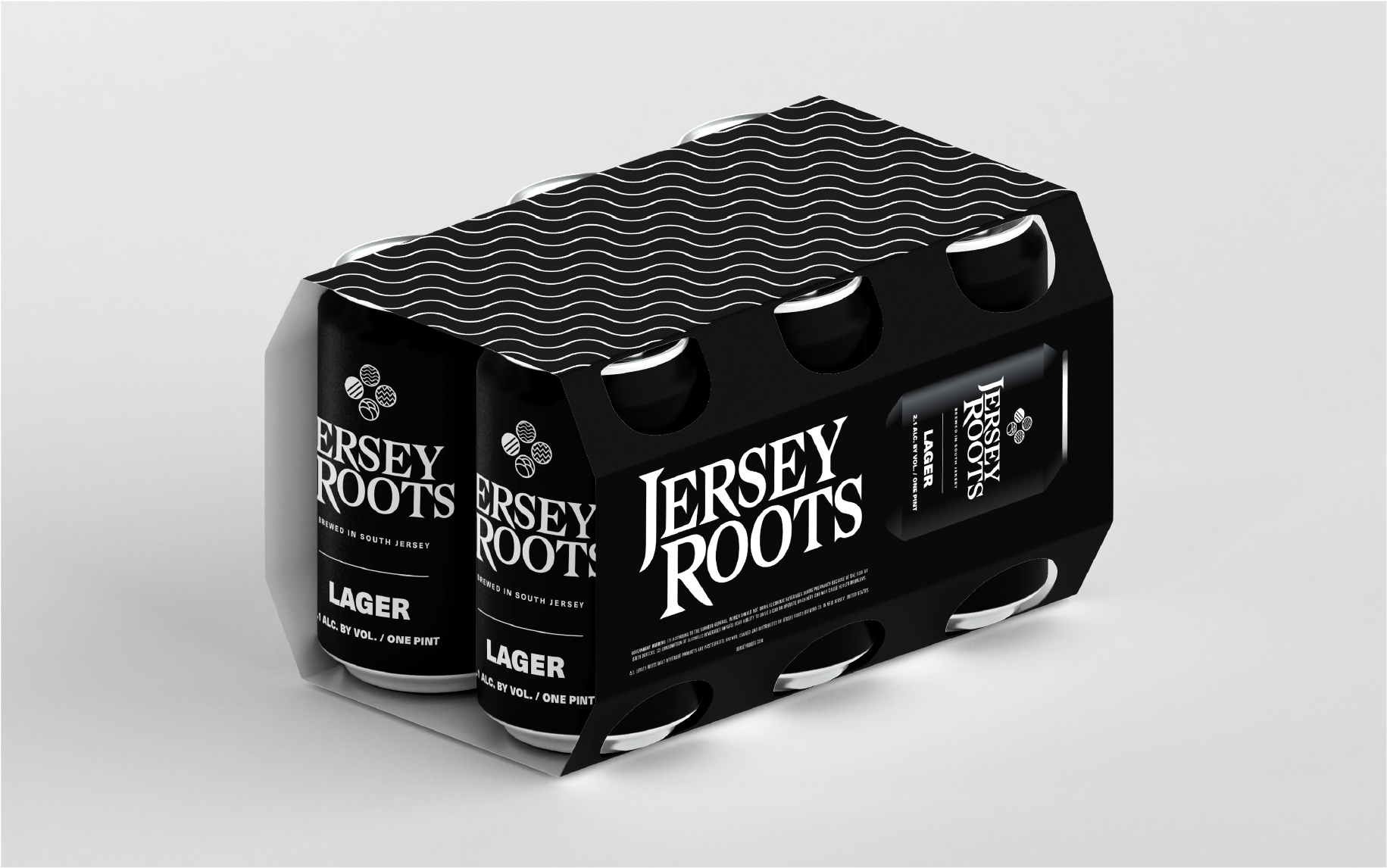
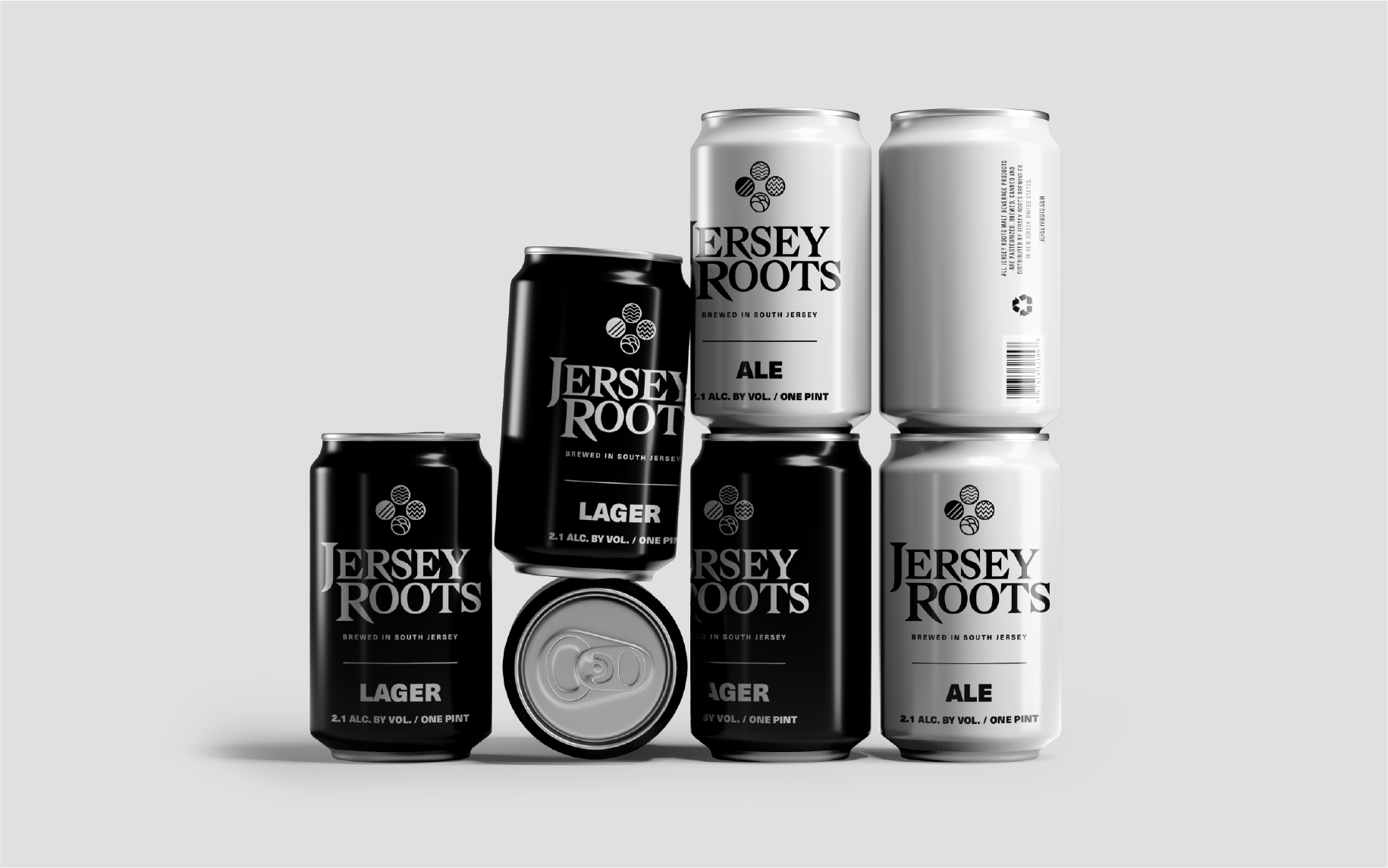
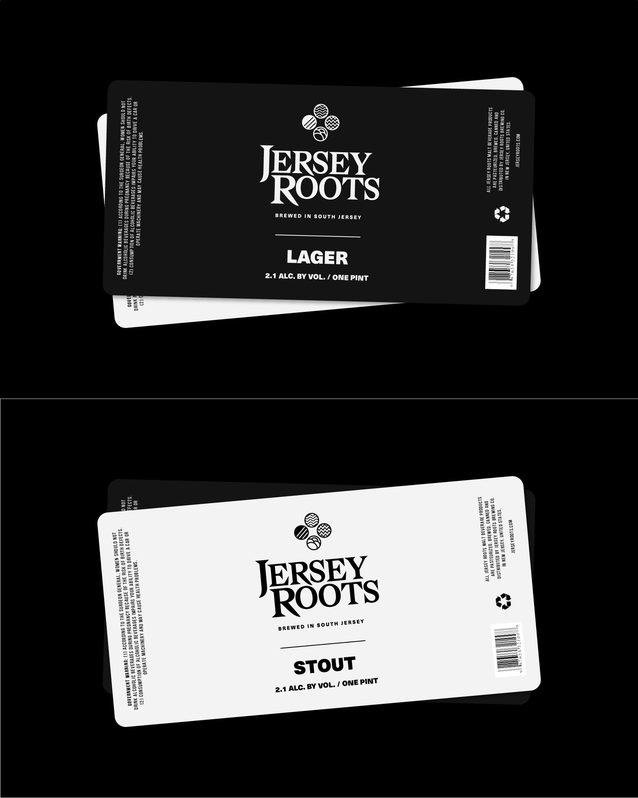
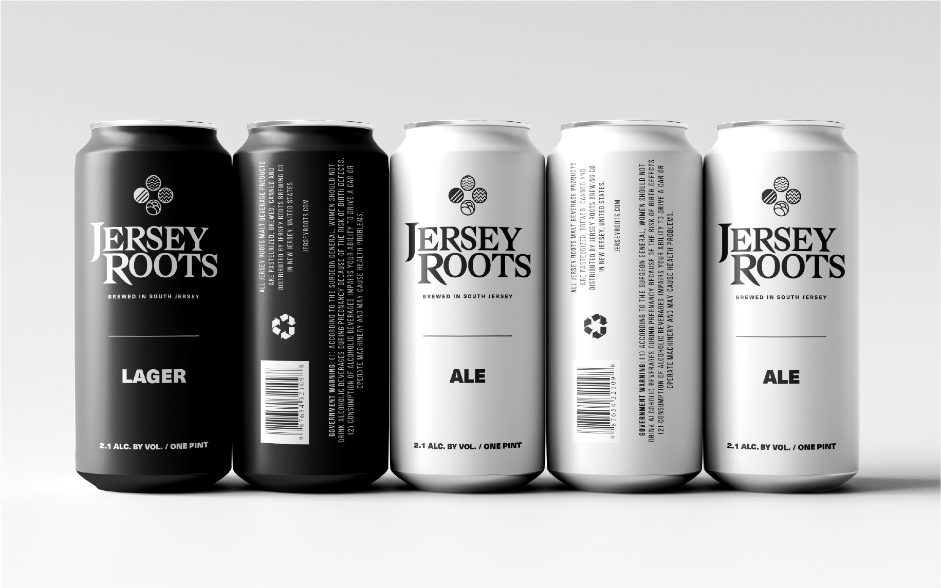
Using black and white colors for the packaging is essential. One reason is to easily categorize the type of beer and also to represent the two geological aspects of South Jersey landscape; the vast woods and its busy cities.
Using black and white colors for the packaging is essential. One reason is to easily categorize the type of beer and also to represent the two geological aspects of South Jersey landscape; the vast woods and its busy cities.
Using black and white colors for the packaging is essential. One reason is to easily categorize the type of beer and also to represent the two geological aspects of South Jersey landscape; the vast woods and its busy cities.
Using black and white colors for the packaging is essential. One reason is to easily categorize the type of beer and also to represent the two geological aspects of South Jersey landscape; the vast woods and its busy cities.
Using black and white colors for the packaging is essential. One reason is to easily categorize the type of beer and also to represent the two geological aspects of South Jersey landscape; the vast woods and its busy cities.
