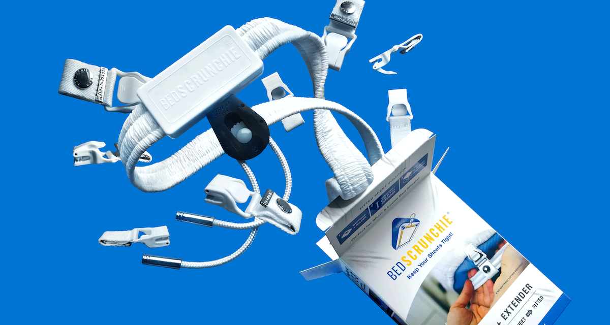
Brand Identity and packaging for a newly invented bed utility product designed to tighten bed sheets and help save sleep.
Sensible, easy, and convenient, Bed Scrunchie is a bed accessory product invention designed to help users tighten their bedsheets, preventing loose sheets minimizing sleep discomfort. Bed Scrunchie is revolutionary in its category. Uniquely constructed for maximum effectiveness. Bed Scrunchie needed branding that would communicate these advancements and most importantly, relate how the bed feels when Bed Scrunchie is in use.
Bed Scrunchie, with its unique functionality, could be a challenge when defining its core visual design, therefore we decided to approach the design in a straightforward way. We developed brand identity, packaging for the product that focuses on highlighting its innovative design and practicality.
Brand Strategy: Jack Nekhala & Mike Nusinkis
Packaging & Stationery Design: Joshua Santos
3D Animation: Maryan Stryzhak
Concept
Bed Scrunchie was conceived back in 2018 as a result of the inventor and CEO Jack Nekhala having his own sleeping trouble with sleeping with wrinkled sheets. Back then, they had outdated-looking packaging. I was hired in 2019 and given the task of making the brand more realized, cleaner, and visually approachable.
After a series of testing and feedback, we discovered that people are having a hard time identifying the purpose of the product due to its obscure form.
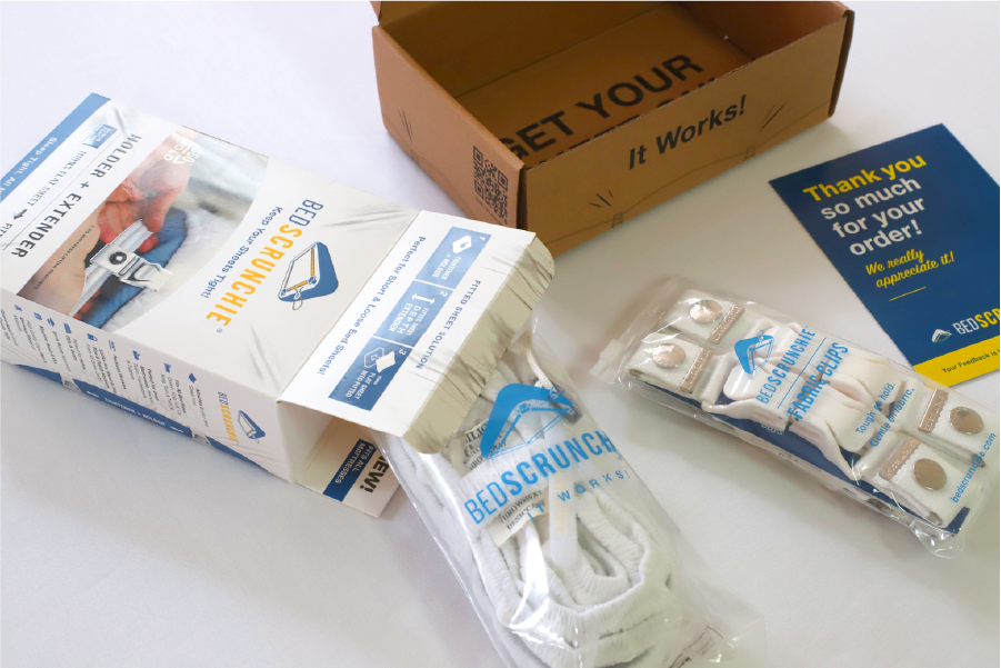
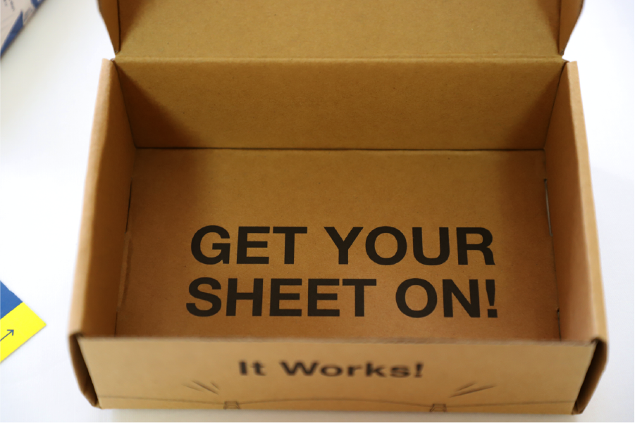
So how can we design packaging that will be recognizable on the shelf; this is the question we constantly have to answer. That is when I proposed the idea of making a packaging box to look like a bed enough to stir curiosity and to be picked up and examined by a potential buyer.
Visual Identity
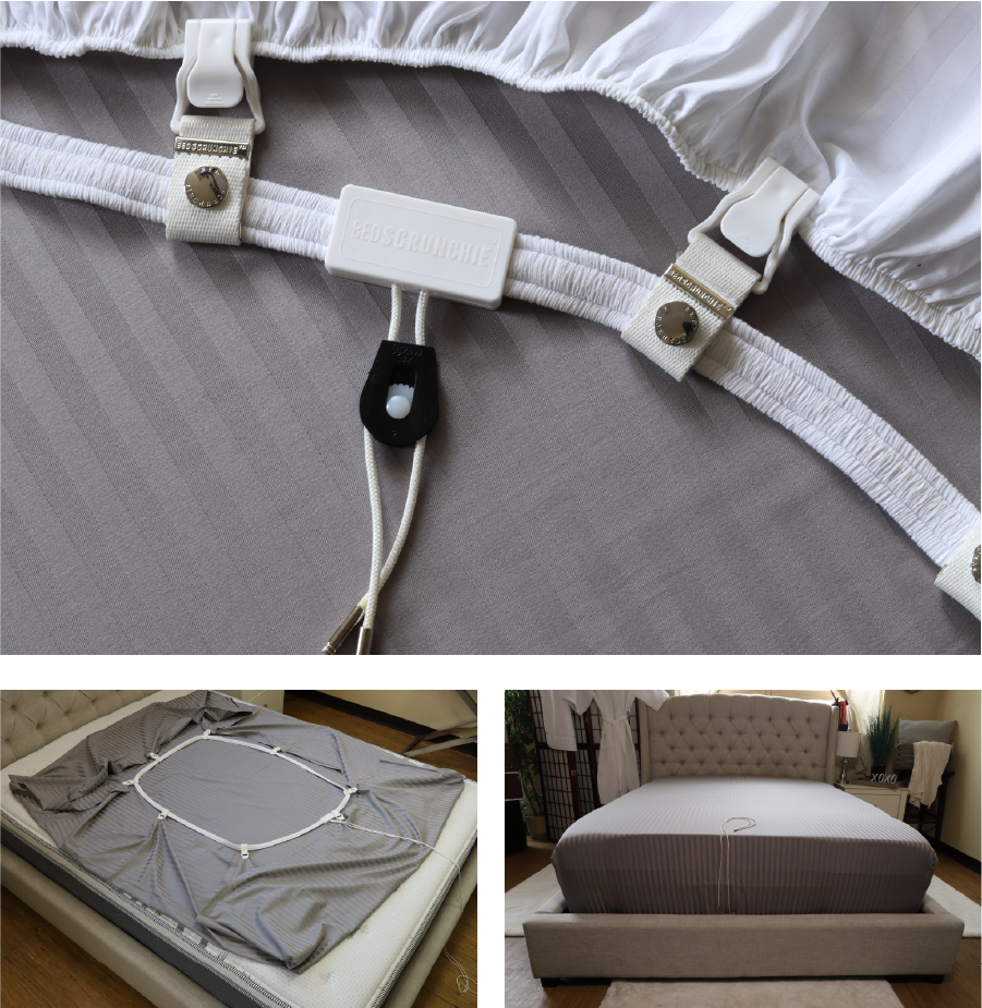
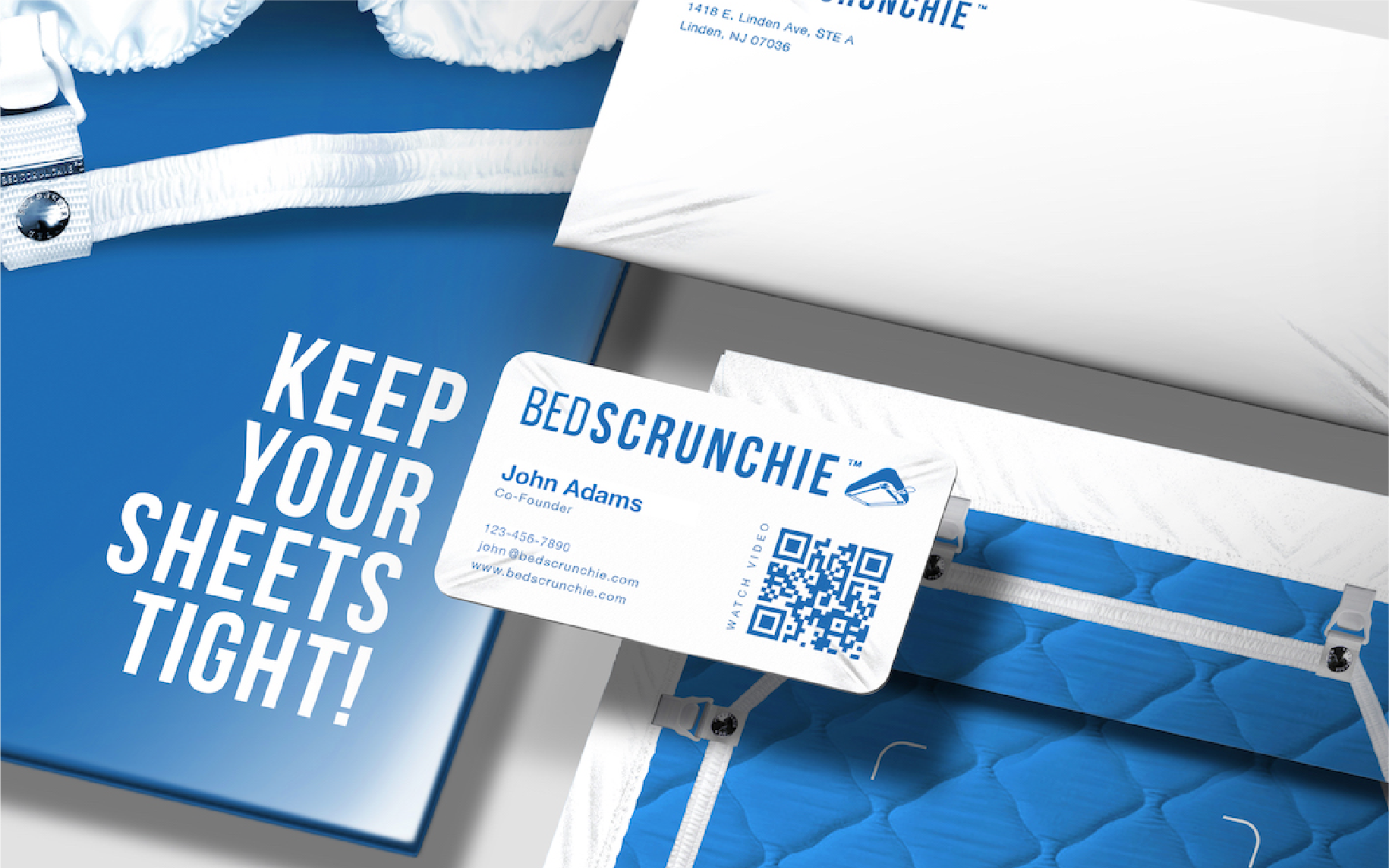
I used the visual characteristics of what a bed with a tight sheet would look like. Characteristics like: stretch marks on the corners, flat and clean on the center with the full display of Bed Scrunchie on the back. We recognize that we have to fully display the action, and give more context to the product.
After conducting a voting poll with their existing customers, we were glad to discover that the new design approach worked better and people responded well.
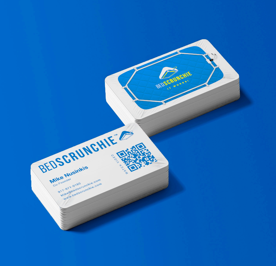
We needed to make sure that the packaging worked before applying the same visual concept to the stationery.
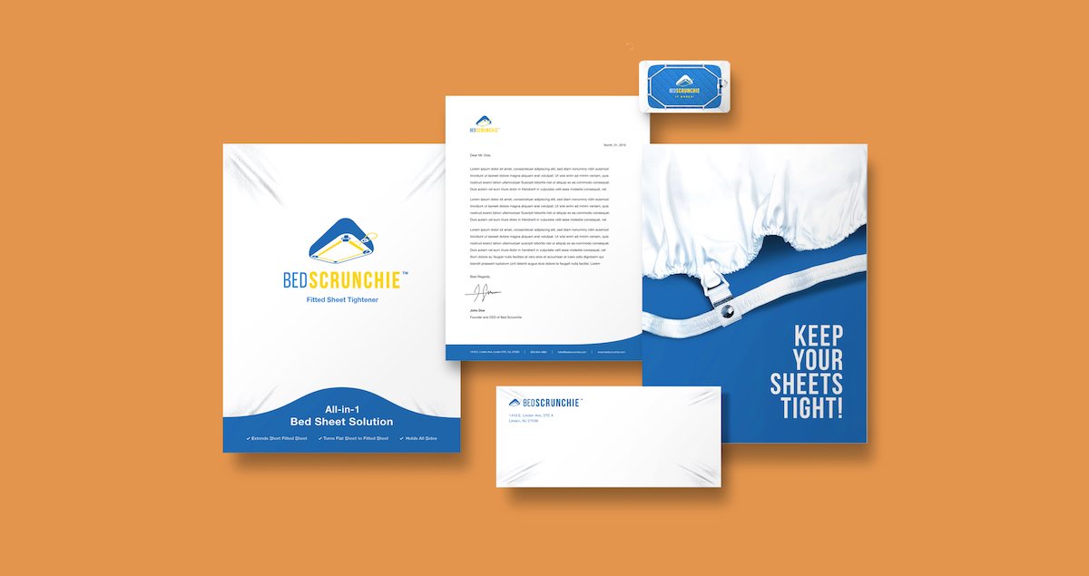
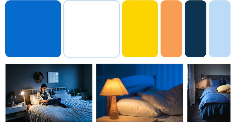
Color Scheme
The main purpose of Bed Scrunchie is to be the solution to the countless restless nights that wrinkly, stubborn sheets make anyone lose sleep. So, I decided to choose colors that would signify and reinforce the feeling of sleeping in an undisturbed and cozy environment.
Results
After its initial website and Amazon store launch, Bed Scrunchie was featured on TV shows like The Wendy Williams Show, Good Morning America, and the news publishing company The Washington Post.
Next Project
King's Kin
Next Project
King's Kin
Next Project
King's Kin
Next Project
King's Kin
Next project
King's Kin