King's Kin
Brand Identity | Self-Initiated Project
King's Kin
Brand Identity | Self-Initiated Project
King's Kin
Brand Identity | Self-Initiated Project
King's Kin
Branding | Self-Initiated Project
King's Kin
A brand identity project for a fashion upstart with a contemporary and vintage vibe.
A brand identity project for a fashion upstart with a contemporary and vintage vibe.
A brand identity project for a fashion upstart with a contemporary and vintage vibe.
A brand identity project for a fashion upstart with a contemporary and vintage vibe.
A brand identity project for a fashion upstart with a contemporary and vintage vibe.
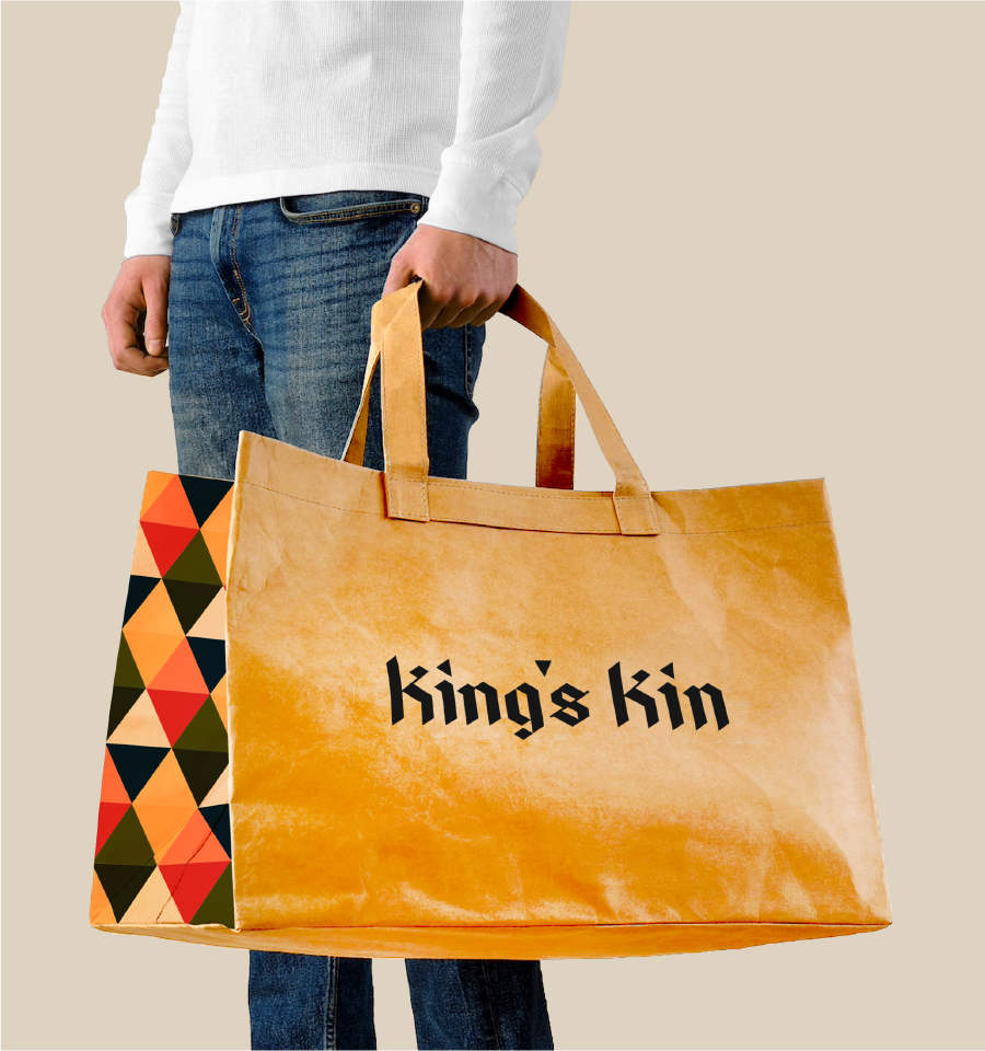
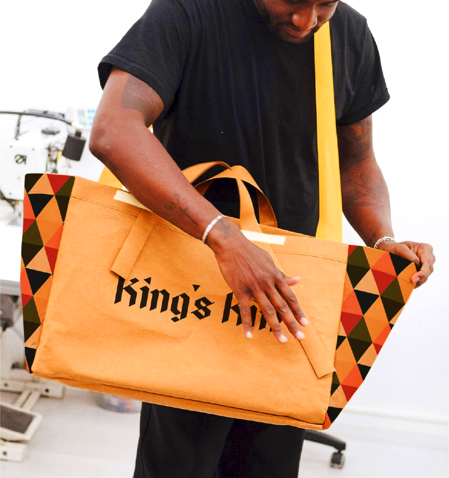
Traditional and modern merges in King's Kin, a fashion brand I conceived that aims to recapture the basics of the old with the boldness of the contemporary. Borrowing ideas from the vintage chic, King's Kin is designed with a solid structure, modular and rich distinct patterns and textures.
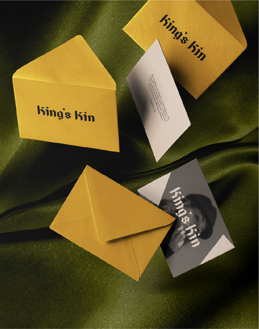
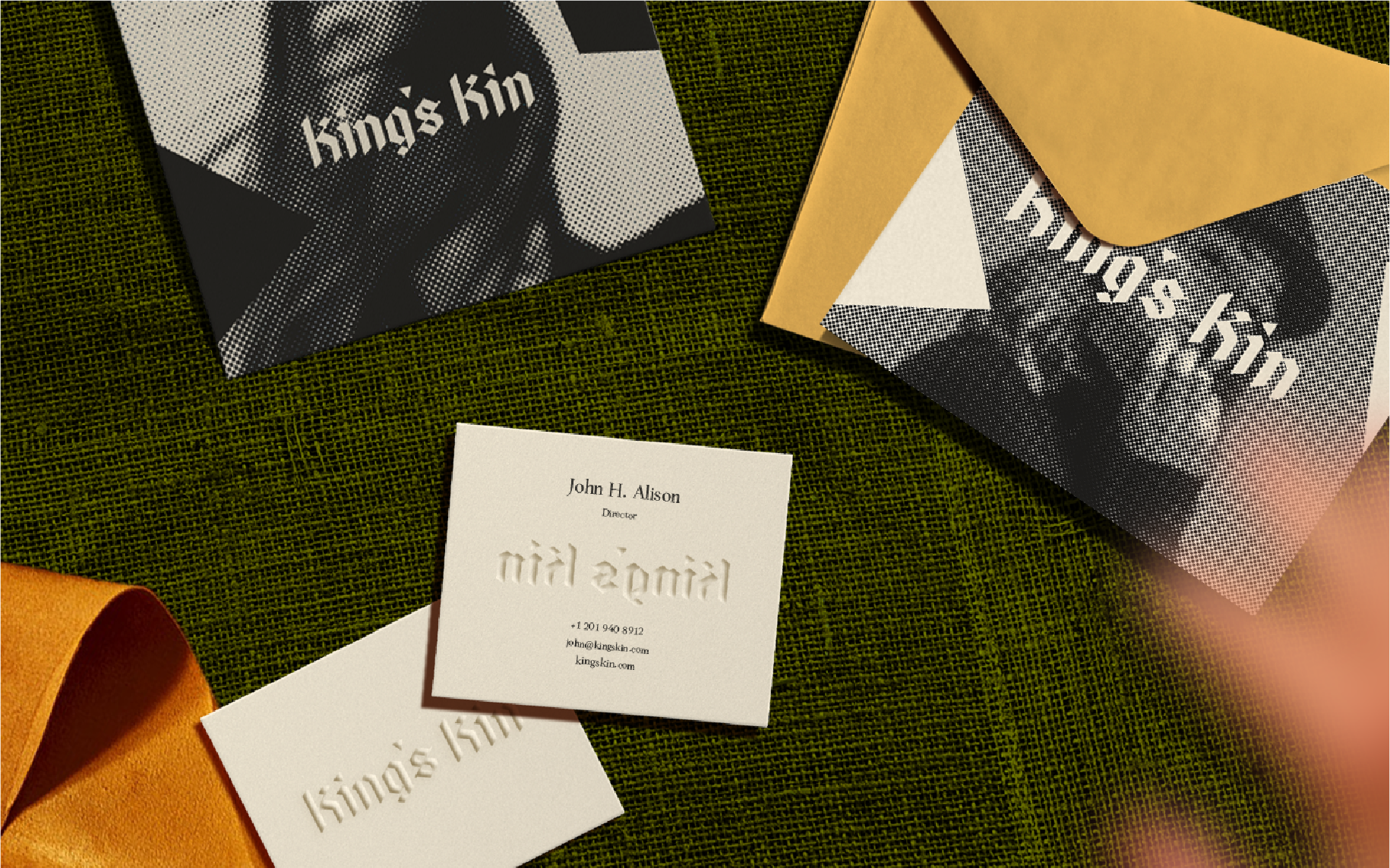
I approached the brand identity for King's Kin that is faithful to the brand's personality, capturing the mix of confidence with its piercing sharp letter mark together with reserved opaque palettes.
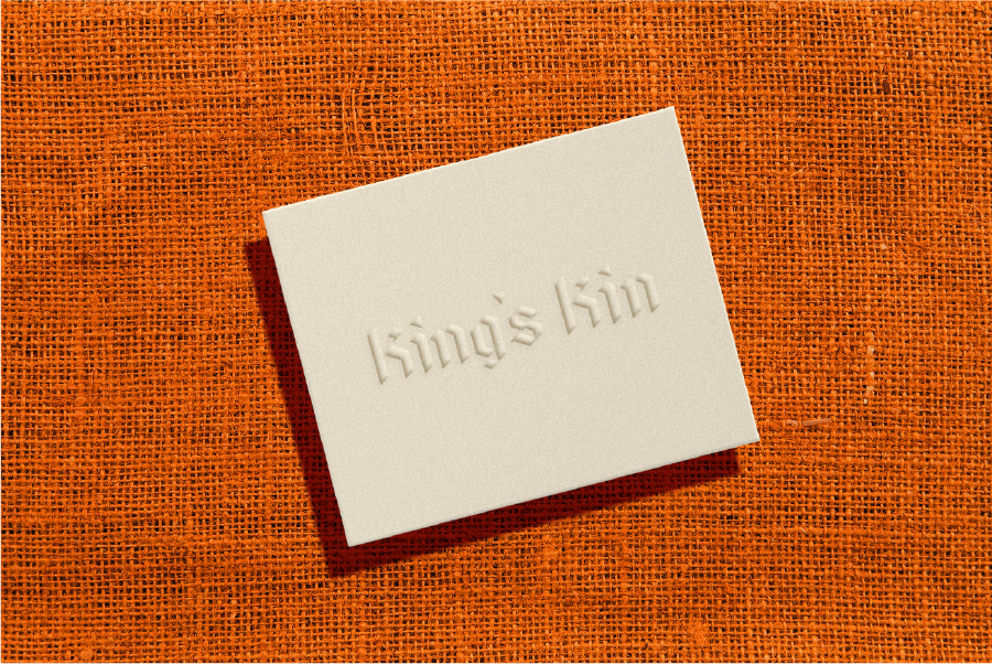
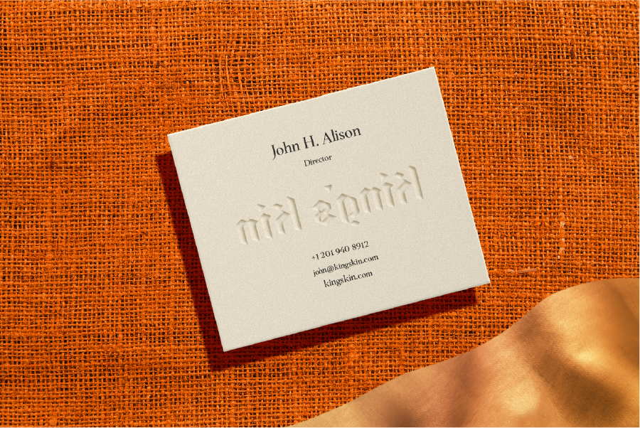
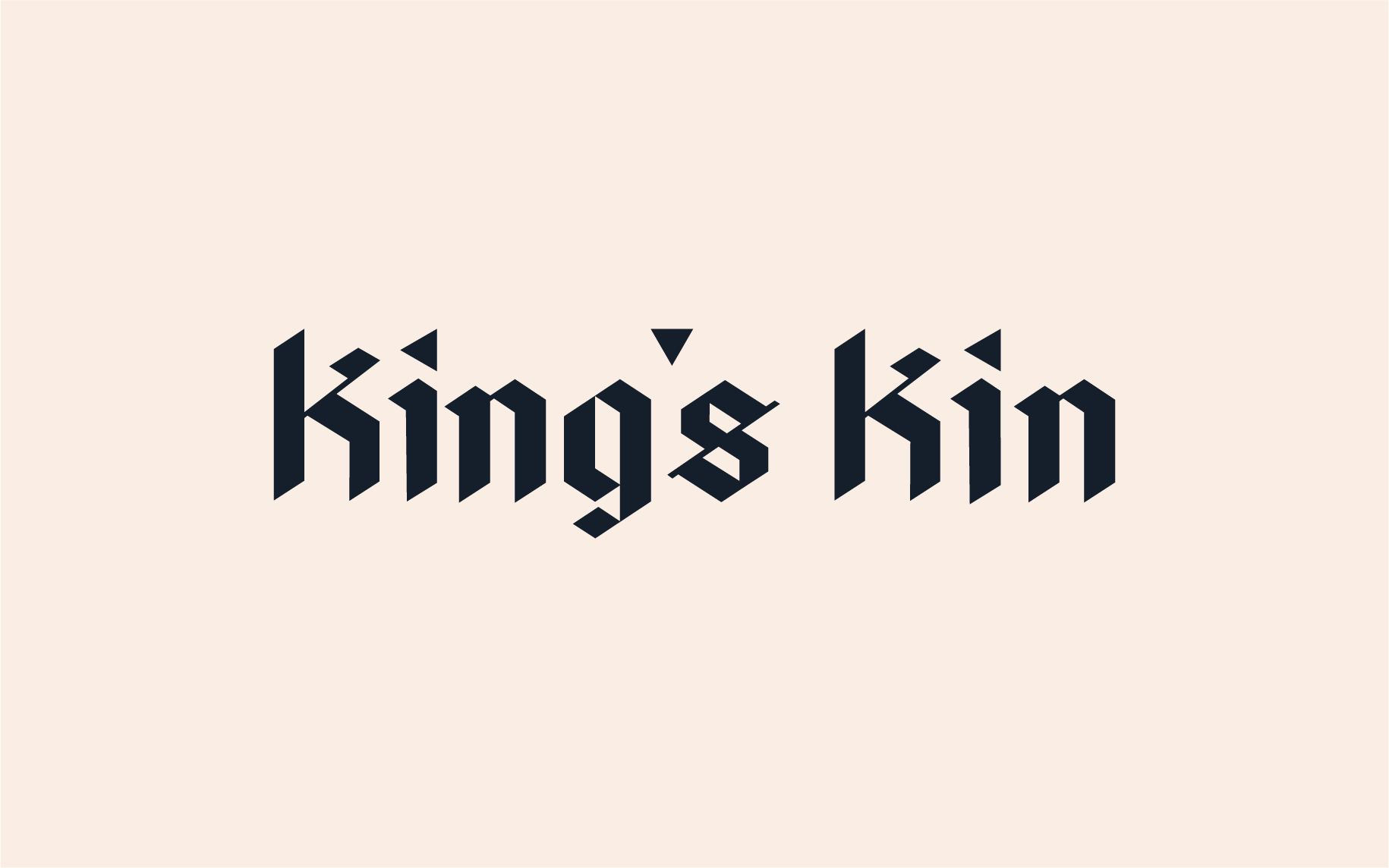
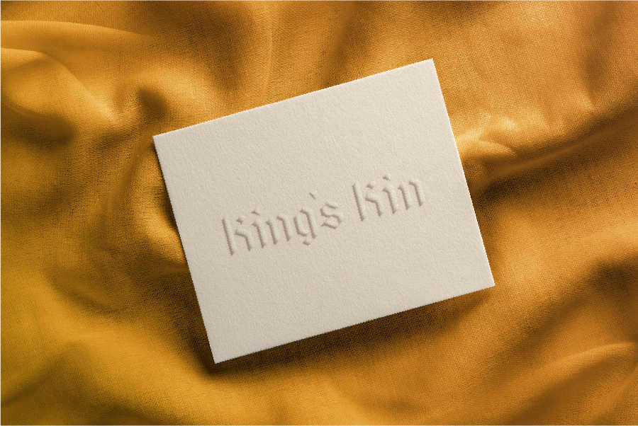
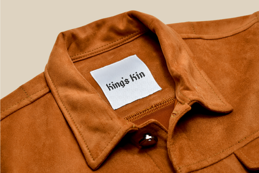
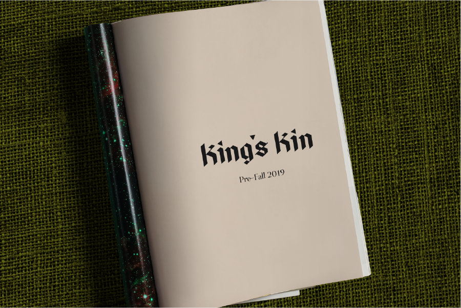
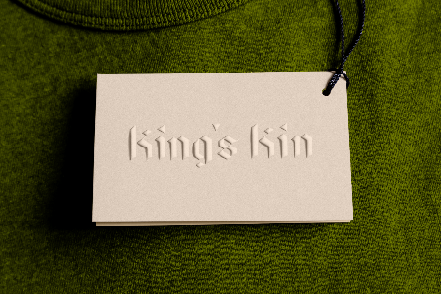
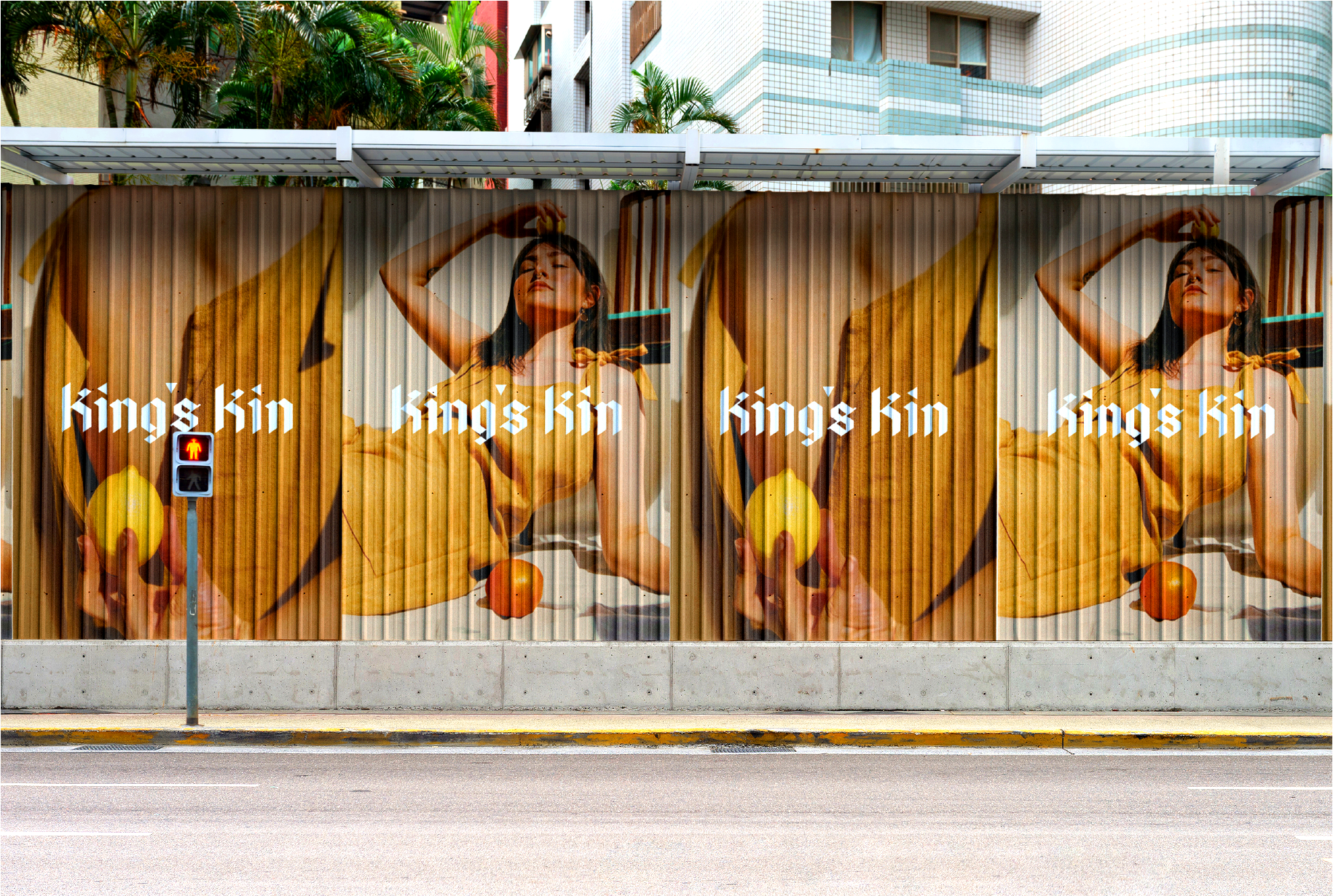
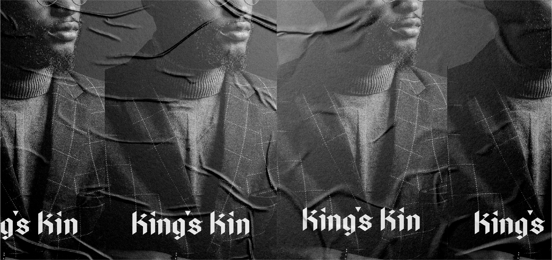
The King's Kin logotype is customized from Bajern, a modern blackletter font by Anton Bolin inspired by Germanic frakturs with a touch of Swedish feel. The end result is a sharp, thick, old-timey, and imposing logotype.
The King's Kin logotype is customized from Bajern, a modern blackletter font by Anton Bolin inspired by Germanic frakturs with a touch of Swedish feel. The end result is a sharp, thick, old-timey, and imposing logotype.
The King's Kin logotype is customized from Bajern, a modern blackletter font by Anton Bolin inspired by Germanic frakturs with a touch of Swedish feel. The end result is a sharp, thick, old-timey, and imposing logotype.
The King's Kin logotype is customized from Bajern, a modern blackletter font by Anton Bolin inspired by Germanic frakturs with a touch of Swedish feel. The end result is a sharp, thick, old-timey, and imposing logotype.
The King's Kin logotype is customized from Bajern, a modern blackletter font by Anton Bolin inspired by Germanic frakturs with a touch of Swedish feel. The end result is a sharp, thick, old-timey, and imposing logotype.
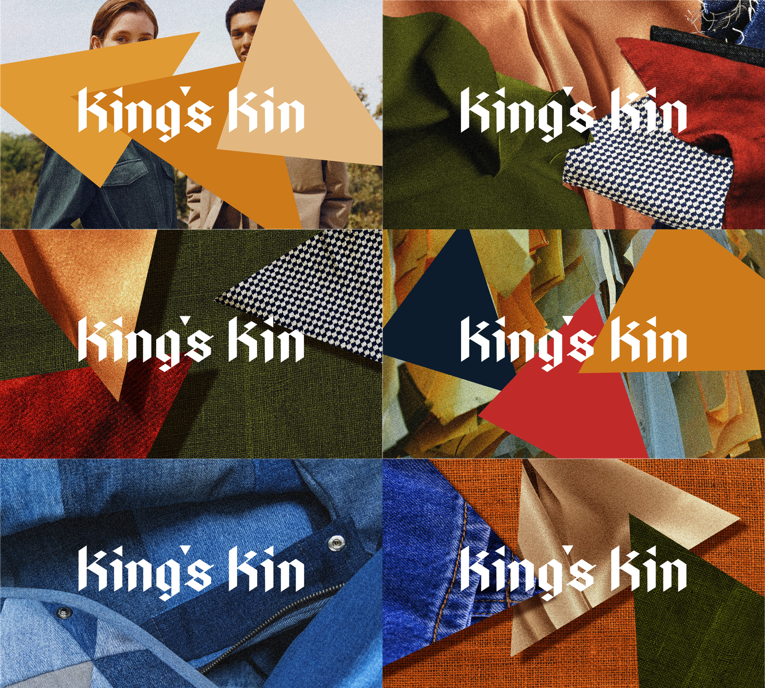
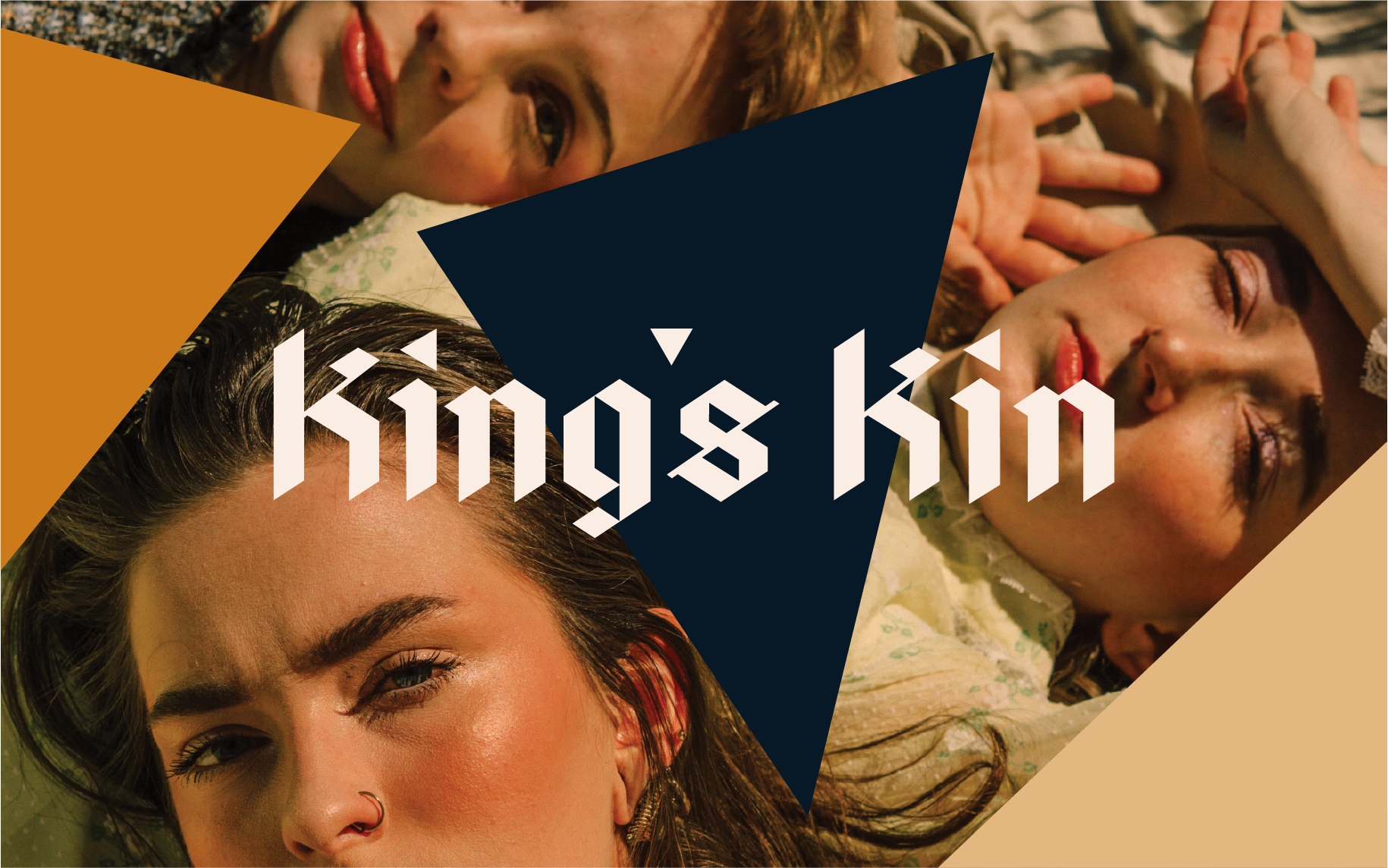
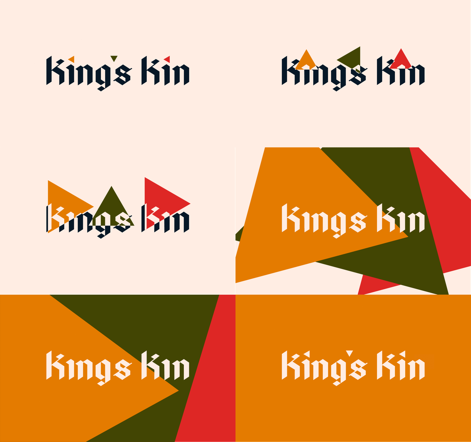
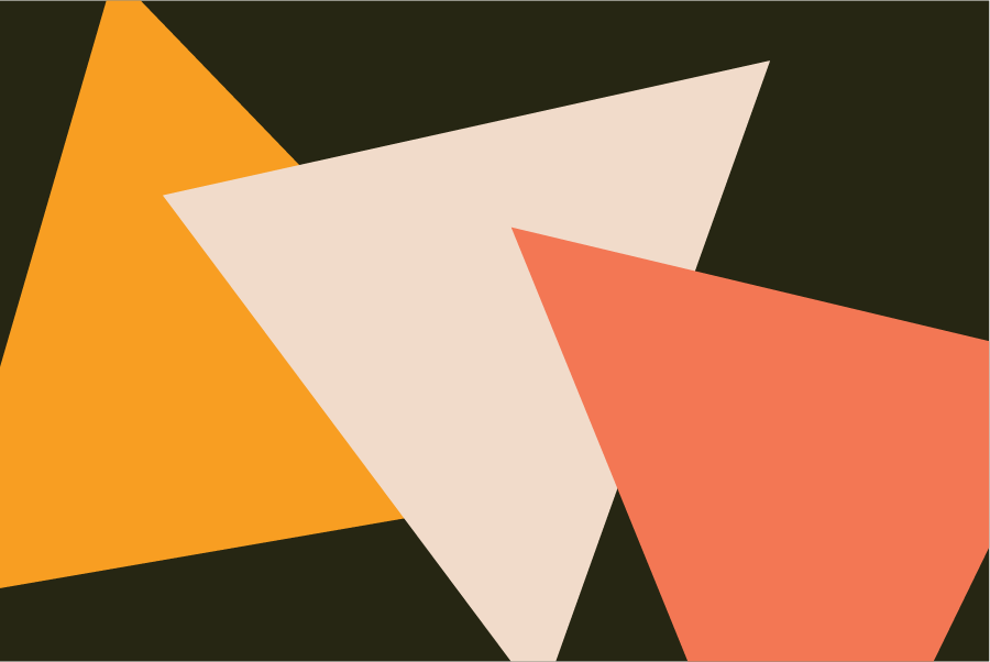
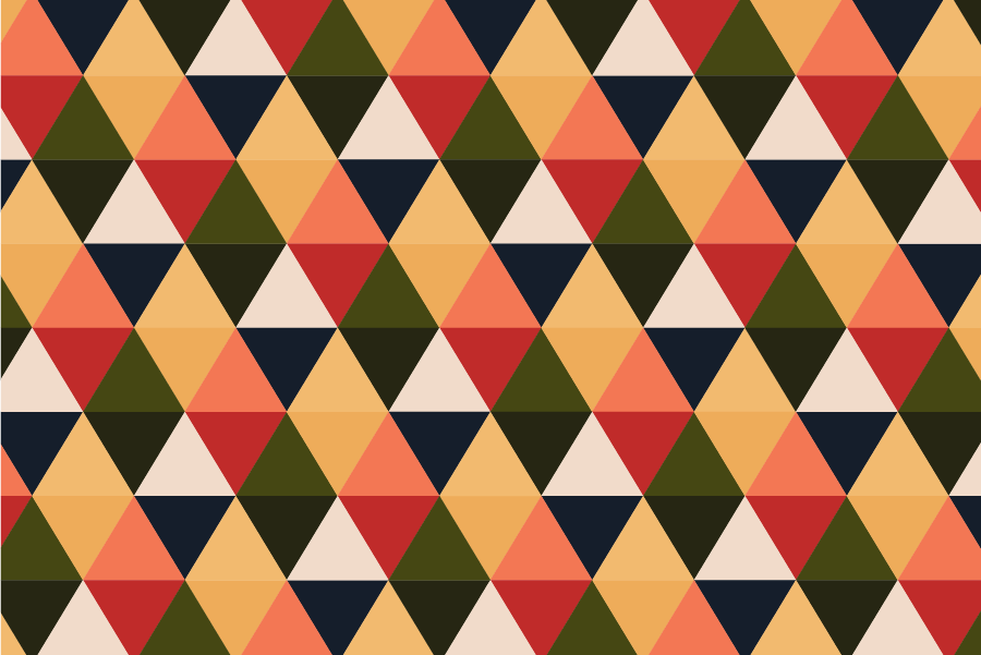
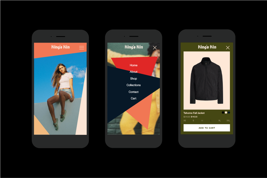
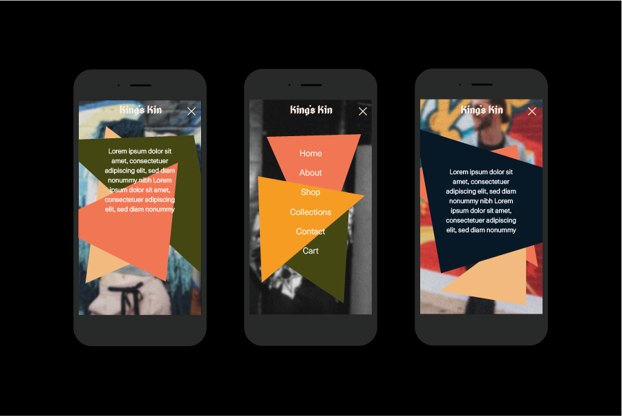
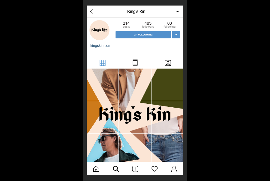
I developed a visual language using the small triangular dots from the logotype. The triangle is one of the most basic shapes that signify the idea of building and craftsmanship.
I developed a visual language using the small triangular dots from the logotype. The triangle is one of the most basic shapes that signify the idea of building and craftsmanship.
I developed a visual language using the small triangular dots from the logotype. The triangle is one of the most basic shapes that signify the idea of building and craftsmanship.
I developed a visual language using the small triangular dots from the logotype. The triangle is one of the most basic shapes that signify the idea of building and craftsmanship.
I developed a visual language using the small triangular dots from the logotype. The triangle is one of the most basic shapes that signify the idea of building and craftsmanship.
